

Case Study: Every Man Jack
Every Man Jack used a modern cart flyout to save two months of dev work and help boost AOV by over 10%.

Ooof! Just LOOK at these shopping cart examples! Plus, the benefits of using a cart flyout, pitfalls to avoid, and best practices.
Are you thinking of switching to an ecommerce cart flyout? Want to get inspired by some good shopping cart examples?
Well, fellow shopping cart enthusiast, you’re in the right place.
In this post, you’ll learn why it’s important to have a well-designed ecommerce shopping cart, the benefits of using a cart flyout, and shopping cart best practices.
Then, feast your eyes on 10 examples of online shopping carts we love. Each one with a stamp of approval from the Rebuy team.
Take me straight to the examples!
And customer satisfaction is the goal.
But what's the solution?
A modern shopping cart supporting a well-designed checkout experience.
A recent Baymard Insitute study shows that 17% of shoppers don’t complete their purchases due to a poorly designed checkout process. Drilling down to understand why customers are abandoning their purchases, and what part of your ecommerce site isn’t clicking, is a vital part of any ecommerce strategy.
It's time to abandon your worries over shopping cart abandonment. Because coming up next, we drill down on the all-important shopping cart—the true workhouse of your ecommerce store. We'll cover associated benefits, best practices, and some effective cart design examples to help you choose the right ecommerce shopping cart for your business.
Sometimes referred to as a cart drawer, slide-out cart, or mini cart, a cart flyout is an ecommerce shopping cart that extends out (or “flies” out) from the side of the screen. It appears when a shopper clicks to add something to their shopping cart or clicks on the cart icon.
Unlike a traditional cart page, the cart flyout lets potential customers view the contents of their shopping cart, make edits as needed, and interact with the shopping cart, without leaving the current page.
To close a cart flyout, all a customer has to do is click the X (typically in the upper-right corner of the flyout) or click anywhere else on the page.

An ecommerce store using a cart flyout enjoys a few important benefits that a typical cart page can't offer.

Today’s shoppers are all about speed and convenience. A shopping cart flyout delivers on those expectations by immediately showing shoppers what they’re purchasing, how much, and what the cost is—all without leaving the page.
For example, shoppers can change the quantity of products they want to purchase, add complementary products, and view the total cost — all from within a (well-designed) cart flyout.
With the shopping cart always available and no need to ever navigate away from the store, customers can continue shopping. (And that's good for business.)
By now, you know cart flyouts are built for continuous shopping. And that's what visitors typically want to do when they visit your ecommerce store. Using a cart flyout can feel like a breeze as customers easily navigate between the cart and the store. Meanwhile, they get to keep shopping and can easily view relevant information in the shopping cart at the touch of a button.
The best cart drawers are customizable, allowing you to include powerful features that help increase sales, like progress bars, trust badges, product ratings, and more.
Ask any ecommerce merchant or manager and you'll find cart abandonment on the list of their worst nightmares. A welcome benefit of using a cart flyout is its ability to minimize the chance a customer abandons their shopping cart.
The combination of convenience and improved customer experience creates a more frictionless shopping experience. The result is a stronger customer relationship and ultimately, more online sales. Customize your shopping cart to include AI-powered product recommendations, social proof, and a progress bar, and watch your average order value climb.
Every Man Jack used a modern cart flyout to save two months of dev work and help boost AOV by over 10%.
Switching from a traditional shopping cart page to a cart drawer or cart flyout is just the beginning. If you want a modern shopping cart that improves the customer experience and boosts your conversion rate, you need to follow fundamental shopping cart design principles.
Let's look briefly at a few shopping cart examples that could use a little TLC.
Technically, yes. This is an ecommerce shopping cart insofar as it shows you what's in your cart. It also shows the total cost and displays a CTA for the checkout page. But it's so small, there's not room for much else.
It looks and acts more like a pop-up than a shopping cart. There's no social proof or product ratings. No product recommendations or personalization. No payment options.
Customers rave about Plugin Alliance's subscription packages and custom bundles. But neither subscription upsells, bundle options, or testimonials appear in the cart. Which is unfortunate because the "Bax EQ" (the item shown in the cart) is offered in bundles elsewhere on the sight.
This cart has so much potential and would likely perform better as a cart drawer.

The following example isn't technically shopping cart, but it has the look and feel of the previous example. When you click the Add To Cart button, this shopping cart pop-up appears suddenly in the middle of your screen, interrupting your shopping. It's just inconvenient enough to sour the customer experience and lead to abandoned carts.

While it doesn't dominate the screen, it essentially prevents you from shopping further until you move it or close it. Customers can't add or remove multiple products (not even one) and instead, shoppers have to click ‘View Cart' to make further adjustments.
Lastly, there are no other cart-enhancing features like we'd mentioned previously (switch-to-subscription, personalized product recommendations, etc.) to really take this cart experience to the next level.
It’s important to use the space in your online store's shopping cart effectively. And yet, playing with space can be tricky whether you’re designing a digital shopping cart or hanging up artwork in your home. Too much space in your shopping cart makes it look sparse and underutilized. Too little space? Cluttered or overwhelming.
Take this one for example:
We love the simplicity of this flyout-style shopping cart but there’s too much empty space here.
This brand could have used this space to promote additional products (or better yet, display personalized product recommendations), discounts, social proof, or a tiered progress bar to reward customers based on their cart total. Not taking advantage of this space to improve your average order value and conversion rates is like leaving money on the table.
Your goal is to make the experience of shopping your online store as delightful as possible for your customer. A good way to achieve this is to turn your typical ecommerce shopping cart into a cart flyout (or cart drawer). That said, here are a few best practices you should follow regardless of the shopping cart style you choose.
This just in: Customers really don't want to pay for shipping costs. Unexpected shipping costs can trigger second thoughts and cause shoppers to hesitate or abandon the cart. To help improve conversion rate, reduce abandoned carts, and earn repeat customers, consider offering free shipping. (Or at least clearly break down the shipping costs).
Customers prefer personalized shopping experiences. According to Baymard, 71 percent of consumers expect companies to deliver personalized interactions. Of all the places in your online store to display personalized product offers, you could make a strong argument that the shopping cart is the best of all.
Savvy ecommerce brands are catching on. Brands like OLLY use personalization in the shopping cart and across their online store to boost sales and enrich the customer experience. So whether you use a traditional cart or a cart flyout, in-cart product offers that complement what the customer already wants is an excellent way to increase cart value and get more sales.
OLLY used in-cart subscription upsells to increase subscription revenue by 63%.

Here's another modern customer expectation. If you want to make it easy for your shoppers to pay you, offering more than one way to pay is essential.
Some payment options save payment and shipping information. These "accelerated checkouts" that information so returning customers can more quickly complete payment for their orders. When a customer returns to a store that offers an accelerated checkout method, their information is automatically filled in at checkout.
Recommended Reading: For even more best practices, check out our piece on 7 Shopping Cart Optimization Tips to Improve Conversions.
What truly makes or breaks a cart flyout is how intuitive and engaging it is.
Ask yourself:
Does it include any features designed to boost conversion rate?
Can shoppers add or remove items with a single click?
Can you collapse the flyout with one click?
Does it offer a user-friendly experience?
Does it look fantastic?
Once you’ve checked ease of use, remember that the best cart flyouts are those that help shoppers discover more products they're likely to buy.
With that in mind, let’s take a look at ten cart flyouts we love.

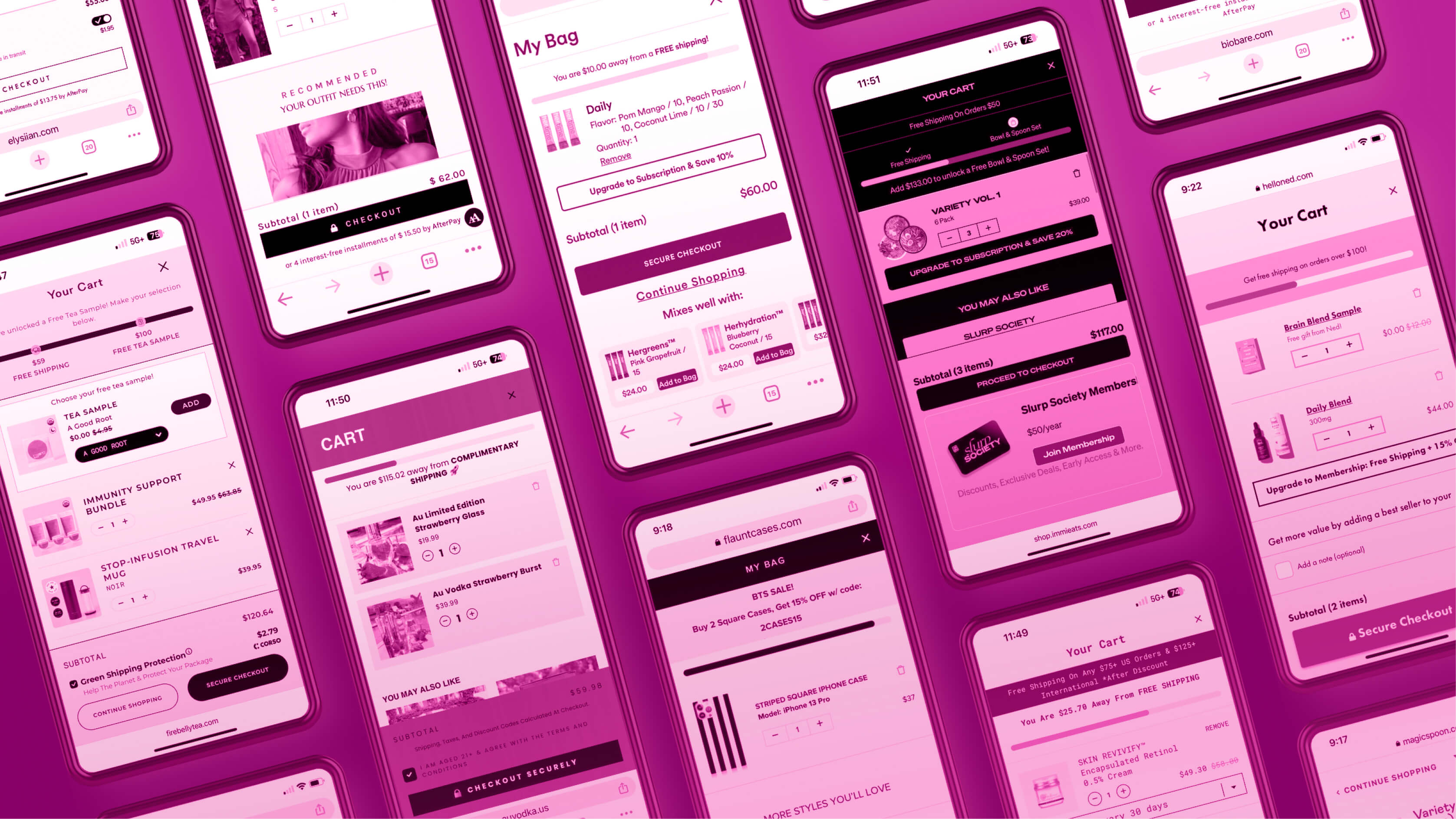
The Elysian flyout-style shopping cart is a great example of effective design and functionality. Its side panel integrates seamlessly with the overall website theme and displays important information like free shipping offers to fight against cart abandonment.
Two things makes this modern cart flyout unique. The first is the option to buy a gift. As you'll see below, shoppers can select options to "Add Gift Wrap" and "Add a Note (Optional)." The second is the addition of a swipable carousel showcasing sale items titled, "Perfectly Priced For You."
The cart drawer also shows added products, prices, subtotal, and recommends similar items under the title, "You May Also Like."
As Rebuy's Account Executive Nate Isham, explains it, "Elysiian just went through launch and their cart is a dream." Learn more about Rebuy Launch Packages here.
The immi cart flyout is perfectly on brand with a simple yet striking color scheme that draws your eye to what's most valuable. In this case, the multi-tier progress bar and the product recommendations.
But what makes the immi example even more special is the bold promotion of its membership program. Positioned at the bottom of the cart, under the "Proceed to Checkout" button, sits a large callout box advertising the program, price, and benefits. immi added this in-cart membership promotion using the Rebuy Smart Cart App for Inveterate. Converting customers into members can help extend customer lifetime value and support your retention strategy.
What's a Rebuy Smart Cart App? Rebuy Smart Cart Apps let you integrate your favorite apps into your shopping cart. This means you can display the functionality of your other apps directly in Rebuy Smart Cart to create a cart that converts. Learn more about Rebuy Smart Cart Apps here.
The Firebelly Tea cart flyout is designed with revenue optimization in mind. Let's go through this beauty.
When the cart is empty, shoppers can still view in-cart product offers and a big "Shop Now" button. The two-tier progress bar recognizes the desire for free shipping while offer extra incentive to get a free gift. There's a spot to add a special message in case you want to gift tea to a friend. But that's not all!
Three cross-sells with attractive photos and product descriptions appear under the "Complete Your Cart" title. Variants give shoppers the option to select flavors. Subscribe & Save buttons make it easy to automate your deliveries and select your preferred cadence. Shoppers can select shipping protection, and the "Continue Shopping" and "Secure Checkout" buttons are large and clear.
What's more, the design is sharp and matches the site perfectly. Every pixel has purpose. We love it!
Ned’s cart flyout really does it for us.
It looks great and it’s totally on brand. Shoppers can easily view the subtotal, the items in their cart, and can add and remove products with one click. Where options are available, variant selectors are provided.
Ned takes full advantage of the space by offering complimentary products to encourage product discovery and boost AOV. This cart also features a one-click switch-to-subscription option which has dramatically improved Ned’s subscriber count.
Other features include star ratings, a multi-tier progress bar, and an announcement bar calling out requirements to reach the next tier. These details significantly enhance the online shopping experience by making the process seamless and engaging.
It’s clean as a whistle, too.
Momofuku is the online business founded by renowned chef David Chang, who has been hailed as one of “the most influential people of the 21st century” by Esquire, and who stars in the Netflix series Ugly Delicious. A big name like Chang needs to honor his brand (and quality cuisine) with an equally tasty user friendly online shopping cart.
At first glance, the Momofuku cart drawer appears to have all the hallmarks of other effective shopping carts on this list. For example, it includes a slick free shipping bar, variant selectors, and unique colors for CTA buttons.
Take a closer look and you'll notice details like star ratings and total review count (via Junip) and slashed prices to show how much the customer is saving.
What we like most is the single line of text that accompanies all five of the in-cart cross-sells. The Noodle Variety Pack includes the detail, "Try all of our noodle flavors & save 10%." The Soy & Scallion Noodles is accompanied by "#1 Best Selling Noodle Flavor." Those spicy details make the in-cart cross-sells all the more compelling.
The shopping cart for spirits brand Au Vodka is simple, effective, and shows off the swankiness of their products. We especially like how the cart's light and bright color palette contrasts nicely against the rest of the store while remaining on brand. This cart employs a powerful shopping cart optimization tactic: large product photos. They're high-quality shots that do the bulk of the promotional work, and do it well.
Details include a note on shipping and taxes and a radial button to confirm age requirement. The cart is topped off with a shipping bar (complete with strawberry emoji) and big, bold call-to-action buttons.
Bottom's up!
What we love about this next example (in addition to the ease of use and visibility) is the creative design.
Health and wellness brand Mixhers designed this custom cart flyout with dev support from the team at Electriq agency.
It features a breakout menu offering personalized cross-sells, an option to upgrade to a subscription for a discount, and a checkbox to manage orders via SMS.
Large images focus attention on the products which can be added to the cart with a single click. Slick. (And creative!)
Not only does Flaunt’s cart flyout include data-driven product recommendations, but it also dynamically populates and changes based on what shoppers add to their cart.
In this example, shoppers are presented with a similar phone case style they're likely to consider.
Two phone rings are also recommended: one that matches the selected case, and one that matches the recommended case should they decide to switch. (Smart!) It’s a strategic way to include intelligent recommendations and increase overall cart value.
An eye-grabbing message at the top advertises sales promotions and the progress bar rewards more spending with free shipping.
Super clean.
Our next example comes courtesy of BioBare. This cart drawer includes some nice details along with themes common to other brands we've seen with strong cart design.
Best practices seen here include Subscribe & Save, variant selectors, clear CTA buttons and a free shipping bar.
Details we love (and don't always see) include the option to Add a Note and the colorful announcement bar to highlight free shipping. We especially love the inclusion of social proof via star ratings for all three in-cart cross-sells. BioBare displays these star ratings via Rebuy's integration with Okendo.
Chef's kiss!
Our final shopping cart example comes courtesy of Magic Spoon. This fun and youthful slide-out cart boasts messaging and design that are completely on brand.
Star ratings (via Okendo) complement applicable cross-sells. And a large Subscribe-And-Save button offering a 25% discount to entice customers to subscribe to items they're already purchasing.
Buyers can discover new items and add them with the click of the mouse, discounts make the recommended products more attractive, and the bold "checkout" button clearly calls shoppers to action.
More, please! 🥣
So how can you build an engaging and seamless experience that is effortless to navigate, easy for customers to add personalized products to their shopping cart, and even rewards consumers for spending more?
Try Rebuy Smart Cart™. It's fast, smart, and flexible, providing shoppers with a truly modern shopping experience. With features like free shipping bar, marketing messages, and countdown timers, you can provide the personalized, convenient shopping experience today's online shoppers have come to expect.
Rebuy Smart Cart includes all of the features you've seen today and more:
Announcement Bar
Tiered Progress Bar
Gift with Purchase
AI-Powered upsells and cross-sells
Switch-to-Subscription upsells & downsells
And because shopping cart design templates can significantly enhance the user experience, Rebuy Smart Cart offers the ability to create custom templates to all users.
Plus, Rebuy Smart Cart maximizes your tech stack with over 35 pre-built shopping cart integrations. Explore Rebuy’s Smart Cart App Store to view the list.
It's not always easy to find the right ecommerce shopping cart for your brand. But we hope these flyout-style shopping cart examples inspire you! When you're ready to explore what's possible, learn more about Rebuy Smart Cart. Or, click below to get a demo of Rebuy.
See for yourself why 10,000+ fast-growing brands use Rebuy to save time, streamline their tech stack, and accelerate sales growth.

•••
Try Rebuy free and see why the world’s top brands use Rebuy to accelerate sales growth.
Interested in partnering with Rebuy? Let's do it.
To keep up with the latest trends, platform updates, and more, follow us on LinkedIn.
Follow these shopping cart best practices to drive conversions, minimize cart abandonment, and improve your online store's overall performance.
Web 1.0 shopping carts are too outdated for today's shopper. Learn why it's so important to update to a modern cart like the Rebuy Smart Cart™.
The holiday shopping season means big business for those who prepare. Here are 7 tips to maximize your BFCM conversions using Rebuy Smart Cart™.


